

It’s not the obvious glitches or clunky interfaces that push them away—it’s the tiny, almost invisible pauses: a flicker of hesitation over a choice, a moment of second-guessing at checkout, a quiet signal that something feels off—none of which ever appear in your analytics. These are the little breakdowns that silently accumulate, and before you know it, repeat visitor numbers start to stall.
Visitors don’t just browse anymore—they evaluate. Quickly. Silently. And today’s buyers rarely give feedback when something feels wrong. They simply move on.
That’s the shift: the customer journey has become increasingly silent. By the time you notice a problem, it’s already costing you—in sales, trust, and returning customers.
If your repeat traffic is leveling off, it’s not random. It’s not always about discounts or retargeting campaigns. The real culprit lies in those easy-to-miss missteps in your experience—the subtle triggers that quietly push people away.
In this article, we’ll uncover the hidden reasons customers aren’t returning—and, more importantly, how to fix those overlooked drop-off points before they quietly drain your revenue. Because tackling what’s invisible might just be the smartest, most profitable move you make this quarter.
Table of Contents
What’s the Idea Behind “Customers Aren’t Returning”?
It means people who bought something from a business once are not coming back to buy again. Imagine you open a small coffee shop. A customer buys coffee from you one day, but they never come back after that. That means the customer didn’t return.
This is a problem because –
Returning customers are important as they:
- Spend more over time
- Trust your business
- Cost less than finding new customers
If customers don’t return, it could mean:
- They didn’t like the product or service
- Prices were too high
- Customer service was poor
- They forgot about your business
Different Fixable Issues Behind Why Customers Aren’t Returning to Your Online Store
1. When Seconds Feel Like Minutes
A few seconds of waiting feels like forever online — and that’s all it takes for visitors to click away before they even glimpse your product or start checkout. Slow-loading sites don’t just nudge users; they quietly increase your exit rates, shorten session times, and reduce your chances of turning browsers into buyers of your brand. Having high speed reflects professionalism and reliability, especially on mobile devices where loading tolerance is minimal.
Therefore, keeping a check on optimizing core web vitals, compressing assets, and using a content delivery network ensures faster response times. Moreover, in the digital marketplaces, performance speed acts as a silent differentiator. Website companies that fail to meet the speed that is expected not only lose traffic but also erode trust, which is a key reason why customers aren’t returning, even before they engage with any meaningful content of the online business firm. As customers become more discerning, especially when their experience with other brands sets a high bar.
2. When First Impressions Overwhelm
Every menu on the digital platform needs to be present for its specific purpose. When menus are overcrowded, the visual hierarchy becomes unclear for the viewer. This affects the pivotal actions the visitor is supposed to take, causing them to become submerged and making the layout look incomprehensible compared to regular brand interactions. A disorganized menu layout holds users back from navigating smoothly to explore the platform, leading to decision fatigue and restricted duration to stay in a website.

Therefore, having a strategic layout of your e-commerce store supports scannability. This assists in the movement of users, reinforces trust, and acknowledges the efficiency aspect of the brand positively before visitors decide to purchase a product. Besides, maintaining consistency in typography, iconography, and spacing helps minimize cognitive overload for prospects and enhances product discovery, which is one of the essential drivers of product conversion in an e-commerce venture to find the product and select it. That’s why it becomes necessary to recognize the difference between simplicity and complexity, and to apply them in the correct required area.
If you are struggling with identifying the reason why customers aren’t returning, then ensure you have a non-confusing or non-cluttered website layout. Make sure you have the essential menu options set up for e-commerce users, and the rest options you may add later based on your business and customer alignment.
Core Menu Items for E-commerce Users –
- Shop / Products – Your main product categories (e.g., “Men,” “Women,” “Electronics,” “Home Decor”)
- New Arrivals – Highlights latest products; appeals to repeat visitors and helps reduce cases where customers aren’t returning
- Best Sellers / Trending – Helps users discover popular items quickly
- Categories – Organized product types (e.g., “Clothing,” “Shoes,” “Accessories”)
- Search Bar – Prominently placed for quick access to products
- Offers / Deals / Sale – Discounts, coupons, limited-time offers
- Cart – User’s shopping cart (with real-time count)
- Wishlist / Saved Items – Let users save for later
- Account / Sign In – Login, register, order tracking
- Track Order – Quick order status lookup
Support & Trust-Oriented Menu Items –
- Customer Support – Help center, contact forms, live chat
- Shipping & Returns – Policies users need before purchasing to address concerns that often lead to customers aren’t returning
- About Us – Brand story and mission (builds trust)
- FAQs – Answers to common user concerns
- Contact Us – Email, phone, address, live chat
3. Ambiguity at the Point of Decision
In e-commerce, a customer cannot evaluate a product’s value or clearly understand how it differentiates itself from alternatives truly without a tangible assessment, which increases buyer apprehension. To counter that, provide clear, structured product information about its specifications, benefits, usage scenarios, and accurate pricing. The presence of such insights empowers customers to make informed verdicts for the product, which could be a favorable resolution for your brand or unfavorable by not making a conversion.
But in this process, what’s most important is that the visitor will keep your brand in mind for future transactions, as they found your brand to help guide them with information. Otherwise, incomplete or vague product details create ambiguity among customers, directly impacting their purchase intent, and even if they purchase and their experience turns out to be not as expected, then they won’t trust the brand as much as they did with the first product
To double-check that all essential elements are included on the product detail page, highlight the following key components in a way that helps customers better understand the product before committing to buy. This will serve to reduce the effort required to assess the product’s relevance by the prospect. If providing such product details is left out, it will increase the probability of customers initiating a return after ordering the product, as the product cannot not live up to what they had hoped for. This will diminish the perceived credibility of both the product and the brand due to leaving out important information.
In order to avoid a situation where the customer doesn’t like the product and ends up sending it back, effort needs to be put into creating comprehensive content that thoroughly sets out all the product details. This approach will serve as a valuable tool for both instilling confidence in customers and enabling hassle-free conversion to cut down on product send-backs, so that your e-commerce store does not have to face why customers aren’t returning to your brand from people who once bought from your brand, and why some visitors haven’t gone ahead with a purchase.
So here’s what’s essential:
- Clearly describe the product’s purpose, features, specifications, materials, color options, and usage to reduce confusion and build trust.
- Provide detailed proportions charts, descriptions, and required instructions for clothing or measurement -sensitive items to give right insights.
- Show total cost upfront including taxes, shipping, and extra fees to prevent unexpected charges and help make sure customers aren’t returning with such issues.
- Clearly state return terms, timelines, and procedures to avoid customer confusion.
- Display products from multiple angles with zoom and usage views to set realistic expectations and reduce returns.
- Provide clear directions on how to use, install, or assemble the product to prevent misuse.
- Share honest reviews and address common questions to help customers make informed decisions and cut down on why customers aren’t returning due to misunderstandings.
- Disclose any important cautions or product limitations to manage expectations.
- Clearly state which products or accessories the item is compatible or incompatible with to head off customers aren’t returning over compatibility issues.
- Highlight key differences with similar products to guide better customer choices.
4. Where’s the Reassurance?
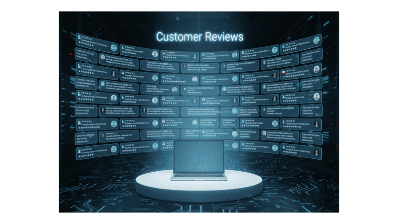
In order to help customers decide on your products, you have to gain points from various aspects of the product. Out of them, one important thing that helps to crack the deal comes with a trust indicator. Hence, it becomes a high priority to convey the trust through other buyers’ perspectives with the help of visuals and stating insights of the product, as to how the product is going to be in terms of its performance.
Without having verified views and for the interested customers not seeing recognizable payment security icons or third-party endorsements, shoppers often question the legitimacy of the business. Omitting these signals stirs up needless wariness that discourage them from trying the product of your e-commerce site.
Especially for first-time visitors, you will try out your brand and the product. Below explains how different social proof elements build trust specifically for e-commerce, and how a lack of them usually points to the cause why customers aren’t returning to your online store.
How Social Proof Transforms E-commerce Trust
| Customer Reviews & Ratings | Testimonials |
| Shows real user feedback on product quality to help shoppers feel confident buying and address issues that might be the reason customers aren’t returning. | These include detailed customer experiences, reinforcing product benefits and reliability to reduce concerns. |
| User-Generated Content (UGC) | Expert Endorsements |
| Photos and videos of customers using products increase authenticity and relatability. | Influencers or industry experts recommending products boost credibility and appeal. |
| Trust Badges & Security Seals | Social Media Metrics |
| Visual cues of safe checkout and secure payments reduce fears of fraud. | High followers and shares indicate popularity, create social validation, and address concerns that customers aren’t returning. |
| Awards & Certifications | Case Studies |
| Recognized honors assure quality and professionalism, helping to address why customers aren’t returning, especially for new customers. | Detailed stories with measurable results increase buyer confidence in effectiveness. |
Customer reviews and ratings offer honest opinions from buyers, while testimonials are selected positive feedback highlighted by brands are to enhance their credibility.
5. The Checkout Question Mark
Payment flexibility influences purchase behaviours, especially among diverse demographics and geographies. For any reason, if the preferred payment options are not mentioned early on the product page or cart page, users’ interest will start to diminish due to unease or assumptions of restrictions on the product before exploring further. This will make them abandon the cart due to experiencing potential concerns.
Displaying popular payment methods reassures customers and reduces doubts early in their buying journey. The presence of such important choices should be shown on the detail page of the product, so that when they are browsing to know the product well, it would help reduce the barriers from the checkout page onward.
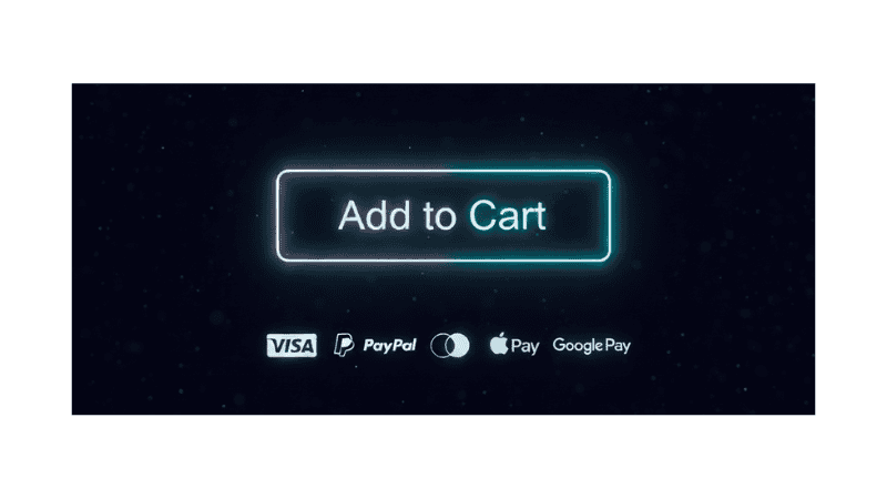
The popular choices of people for buying the product are – credit cards, digital wallets, and local payment gateways are some of them. Additionally, offering prospects instalment plans or buy now and pay later services increases their accessibility to buy the product, and a business could also expect a conversion of the product.
Take a look at a quick guide on which payment options work best in different e-commerce situations — and how limited or inconvenient choices might lead to a situation where customers aren’t returning. Match payment options to your customers’ preferences and purchase context. Offering variety and convenience reduces cart abandonment and boosts sales.
New Customers / First-time Buyers
- Trusted options like Credit/Debit Cards and PayPal help build confidence.
- Secure payment badges boost trust, helping prevent scenarios where customers aren’t returning.
Repeat Customers / Loyal Buyers
- One-click payment options (saved cards, Apple Pay, Google Pay) speed up checkout.
- Subscription billing for recurring products.
High-Value Purchases
- Installment plans or Buy Now, Pay Later (BNPL) options ease the financial burden.
- Offer secure escrow services for high-ticket items in the initial time.
Mobile Shoppers
- Mobile-friendly options like digital wallets (Apple Pay, Google Pay).
- Simple, fast checkout flows help prevent issues where customers aren’t returning.
International Buyers
- Local payment methods.
- Multi-currency and currency conversion options.
Budget-Conscious Customers
- BNPL or installment plans.
- Payment options with cashback or rewards, helps avoid losing sales by addressing why customers aren’t returning.
Early Tech Adopters
- Accept cryptocurrencies or newer digital payment methods.
- Offer contactless or QR code payments.
Older or Less Tech-Savvy Customers
- Traditional methods like credit/debit cards.
- Cash on Delivery (COD) where possible.
6. Delivery Doubts and the Cart That Never Completes
Hidden or unclear shipping costs or data when revealed suddenly at the checkout page, without any prior mention, lead to last-minute abandonment at checkout. Customers want full transparency of all facts to make a judgment. When these facts are left out from the description and only appear at checkout, it often feels like a breach of trust, which harms the business in the long run, starting from the current time, as the customer won’t return to the same brand.
Moreover, what leads to situations where customers aren’t returning after becoming consumers, can commonly be traced back to poor communication, especially regarding shipment delays. That’s why it’s important to know the different types of potential delays before moving ahead. The following are the types of delays in e-commerce that are typically out of the seller’s hands when not planned, but need approachable solutions to fix effectively so that customers do not encounter any trouble. This will help to set up transparent communication, and proactive notifications can help build reliance and prevent customers from running out of patience by keeping them informed about the situation.
- Natural events like storms, floods, or snow can delay transit and delivery.
- Internal delays within courier services may lead to frustration and contribute to situations where customers aren’t returning.
- International shipments can be held up due to inspections or paperwork issues.
- National or regional holidays can pause fulfillment and carrier operations, sometimes resulting in situations where customers aren’t returning due to delayed orders
- Strikes at ports, postal services, or transport companies affect timelines.
- Events like COVID-19 disrupt entire supply chains and logistics networks.
- Backlogs at major shipping ports cause delays in offloading cargo.
- Sudden regulatory changes can hold up shipments, especially across borders, which may be a reason customers aren’t returning.
- Mistyped or incomplete addresses can lead to rerouting and delivery delays.
- Issues with manufacturers or wholesalers delay shipping readiness.
7. Navigation That Lacks Direction
For more than a decade, customers have been making use of online marketplaces to purchase products. As a result of this long-standing familiarity, users now bank on intuitive navigation menus setup, a logical site hierarchy, and a search tool to quickly locate the items they’re after.
Complex or inconsistent navigation disrupts the process of discovering a product and degrades their overall shopping experience inclusiveness. When the inclusiveness of these systems fails, confusion increases, and engagement drops if the visitors at that moment are running short of time.
The ineffective navigational structures are often the result of customers staying on a page too long without any forward progression, leading to the loss of customers if they do not check out the brand again. So, streamlining the navigation through a filter or reductive search that narrows results by preference breaks through roadblocks and helps them to move through their options more quickly.
Given that a well-architected navigational framework contributes directly to easily finding and understanding the products, leading to higher conversion rates, and a stronger brand perception is created. When users can’t easily find what they’re looking for, trouble builds and purchase rates decline.
To address the concern of search suggestions that boost sales success, along with their situational use cases, are mentioned to show what and when works best, so you don’t overlook the issues prompting why customers aren’t returning even if your products are in great demand as per statistics.
How to Enhance E-commerce Search Experience
Knowing the following will help your business avoid any issues because of customers aren’t returning.
E-commerce Products Suggestion Types
- Popular Product Suggestions
- Personalized Recommendations
- Auto-Complete with Product Matches
- Category-Based Suggestions
- Recently Viewed Products
- Related Searches
- Filtered Results Previews
- Promotional Tags
- FAQ / Help-Based Suggestions
- Typo-Tolerant Suggestions
Why It Boosts Conversion
- Surfaces trending or most relevant products
- Reduces decision fatigue with reminders
- Increases personalization & intent-match
- Prevents bounce due to friction or errors
- Adds urgency and boosts perceived value
- Improves user flow for both new and returning visitors
- Offers reassurance with helpful answers
- Encourages exploration without confusion
- Supports error handling (typos, vague terms)
- Keeps mobile users engaged — especially when customers aren’t returning
When to Use It
- During seasonal launches or high traffic events
- With returning users and logged-in accounts
- On mobile devices where input effort matters
- For stores with large or technical catalogs
- When you want to recover abandoned journeys
- To guide new shoppers or first-timers
- While running flash sales or exclusive offers
- When analytics show repeated input mistakes
- For language-diverse audiences
- As part of re-engagement efforts if customers aren’t returning
8. One More Account They Didn’t Want to Make

Mandatory account creation adds extra hold-up to the purchase journey of prospects when they see you as a brand for the initial visit. For many, the brand feels distant and unfamiliar when they are stumbling upon your company for the first time. At that instance, they are considered low-commitment buyers who prefer recommendations from others or need to eventually earn confidence before commitment.
For such potential buyers, providing them with a guest checkout option provides the means to self-certify about the brand before prospects make up their mind to finalize their purchase. On the other hand, if your e-commerce makes it compulsory to register before checking out, it disrupts the momentum to build engagement, and high exit rates can be seen from the platform.
In some cases, interested customers will delay their purchase to give a new brand a chance, or some people will never return out of scepticism since they do not want to share credentials at such an early stage. To confront the setback, offering a guest purchase simplifies the process of learning about the company and respects user preferences for privacy and emotion, helping them like the company at the outset.
Safe, focused designs provides accessibility for all user styles and improve satisfaction. Hence, performance can be known after ,monitoring essential metrics for your guest checkout option, which is crucial to understand why customers aren’t returning to your e-commerce company and how to improve the consumers’ buying experience.
- Guest checkout usage rate measures the portion of total checkouts completed using guest checkout compared to registered account checkout and helps understand how many users prefer guest checkout.
- Conversion rate for guest checkout users reflects the share of visitors who complete purchases using guest checkout, which can be compared with registered users to identify sales issues.
- Checkout abandonment rate among guest users tracks how many begin guest checkout but leave before finishing, identifying friction points that might explain why customers aren’t returning.
- Time to complete checkout (Guest vs Registered) compares the average time guest users take to finish checkout against registered users, with shorter times indicating a smoother guest experience.
- Post-purchase account creation rate from guest users shows the share of guest checkout customers who create accounts after buying, indicating how well registration prompts reduce customers aren’t returning.
- Customer satisfaction / feedback scores for guest checkout gather user ratings or NPS specifically from guest checkout customers to measure perceived ease and satisfaction.
- Repeat purchase rate of guest checkout users tracks how many guest checkout customers return to buy again, helping evaluate the long-term impact on loyalty.
- Cart abandonment rate before checkout (Guest vs Registered) compares abandonment before starting checkout between guests and registered users to identify if guest checkout reduces early drop-offs.
- Error/issue rate in guest checkout flow counts technical issues or user errors reported during guest checkout, ensuring the process is technically seamless.
- Percentage of users who switch to registration mid-checkout monitors guests who start as guests but create accounts before completing checkout, showing user preferences around mid-checkout registration.
9. Not Every Pop-Up Is a Good Idea
Pop-ups that appear at inopportune times or dominate the screen can discourage any buyers who are engaging with a company during their beginning stage of interaction or after they have been exposed to multiple ads. When people browse products and ads show up too often—especially when they block key content of interest or are difficult to close—this results in discomfort. It drives users away even more when the advertised products don’t align with their needs, causing customers aren’t returning.
Although pop-ups help an e-commerce site retain its visitors, for first-time prospects, certain types of pop-ups can be off-putting and harm the user experience. The following are the types of pop-ups to avoid for first-time visitors. But before that, instead of introducing the customer to new products through pop-ups or signing up for email marketing, it’s best to use user engagement tools like exit-intent offers or timed welcome messages, which should be contextually triggered and value-driven.
Moving on to Exit-Intent and Timed Messages, this approach portrays your brand as one that respects the user’s journey by putting forward value first and delivering offers at thoughtful times—without creating the pressure commonly experienced in immediate pop-ups, which can make user interaction unstable. Modifying the platform based on users’ page histories or customers’ mobility maintains targeted offer relevance and enhances its functionality.
Also, when utilizing non-intrusive formats, ensure that design elements don’t interrupt or block the user’s experience. Using slide-ins or embedded CTAs lets visitors keep up their browsing experience as it feels natural and less aggressive. Making users more likely to interact with it, unlike intrusive ad types. This might push up bounce rates and take a toll on the brand’s reputation. Respecting what users lean towards is a must, especially when customers aren’t returning.
So, after carefully setting the stage, pop-ups maintain a balance between engaging users and keeping the site easy to use when it comes to presenting pop-up messages. On top of that, knowing the effects and results of pop-ups for first-time visitors will help you understand why customers aren’t returning, what actions to take to keep them coming back, and what correct actions will ensure they respond to your proposal.
| Type of Pop-up | Why It’s Bad for First-Time Visitors |
|---|---|
| Immediate Full-Screen Pop-ups (Interstitials) | Blocks entire screen, frustrates visitors before they see your content |
| Exit-Intent Pop-ups Too Soon | Feels pushy, triggers before users engage with site |
| Auto-Playing Video or Audio Pop-ups | Startles visitors, increases bounce rate |
| Overly Frequent or Repeated Pop-ups | Bombards users, causes annoyance and lowers trust |
| Pop-ups With Too Many Fields or Long Forms | Overwhelms visitors, deters casual browsers |
| Aggressive Discount or Sales Pop-ups | Cheapens brand perception, feels insincere |
| Pop-ups That Cover Navigation or Main Content | Prevents natural site exploration, frustrates users |
| Pop-ups That Interrupt Checkout or Important Actions | Disrupts purchase flow, causes drop-offs |
| Pop-ups Without Clear Close Button | Hard to dismiss, increases frustration |
| Pop-ups Triggered by Time Instead of Engagement | Feels intrusive if visitor hasn’t interacted yet |
10. When Pictures Don’t Speak
Taking action without context rarely goes unnoticed; in fact, content plays a crucial role in guiding customer engagement in e-commerce. On your brand’s dedicated site, using low-quality visuals—such as blurry, poorly lit images or none at all—can weaken user perception and interrupt their progress before they complete the buying step.
Dropping the ball on imagery aspects signals lower quality or outdated business operations, leading customers to decide against buying the product.
Consisting of detailed, quality product photography enables users to figure out the selected on-screen product’s texture, color, and sizing remotely.
Implementing close-up functionality, multiple angles, lifestyle imagery, and even adding short product videos dials up the product’s appeal.
Products that are technically focused or aesthetically specific, with visual clarity, are frequently more effective in driving sales than plain text.
Proper visual storytelling enhances credibility to match the claim and picture to start preferring a product by the customer, and aims to bridge the gap between online and in-person retail experiences of the product by interested customers.
This underscores the significance of understanding how a high-quality product image is defined by several essential characteristics that ensure it effectively showcases the product, builds buyer assurance, and assists in resolving the challenges that cause customers to send items back. The foundations of having a strong product image are —
- High Resolution: The image should be sharp and clear with enough pixels to allow scaling up without losing detail, ensuring customers aren’t returning due to poor image quality.
- Good Lighting: Proper lighting highlights the product’s true colors, textures, and features without harsh shadows or overexposure.
- Accurate Color Representation: The colors in the image should closely match the actual product to avoid misleading customers.
- Clean Background: Usually a plain, uncluttered background (like white or neutral tones) helps the product stand out.
- Multiple Angles: Showing the product from various perspectives helps customers understand its shape and details better.
- Consistent Style: Images should follow a consistent style or theme to maintain brand identity and professionalism.
- Proper Framing and Composition: The product should be centered and framed to highlight its best features.
- True-to-Size Appearance: Images should give a realistic sense of size and scale, sometimes supported by comparison objects, preventing scenarios where customers aren’t returning.
- No Distracting Elements: Avoid watermarks, logos, or other overlays that can detract from the product itself.
- Optimized for Web: Images should be optimized to load quickly without sacrificing quality for a smooth user experience.
11. That “Too Expensive” Feeling
When a product’s price is higher than that of competitors without an apparent justification, potential customers often abandon the payment stage with that brand. High perceived cost without accompanying additional value triggers comparison shopping, making it a price-sensitive product.

So the value of communication in reaching out to potential buyers must happen early in the buying cycle; without it, even small differences in pricing can hold back sales.
When you are portraying your product as value-driven, then the focus needs to be shifted from cost to benefit with the help of transparent pricing, visible savings, and loyalty incentives. All the factors that are separate from one another become significant, like product quality, unique features, social proof, or bundled offers. Otherwise, due to the misalignment of elements, it can distort perception.
Customers evaluate price versus quality by seeking the best value before deciding to buy again, which usually reveals the true reasons customers aren’t returning. In the following, find out how to balance price and quality effectively to keep your customers coming back.
Customers assess price-quality balance through:
- Product reviews and ratings
- Brand reputation and trust signals
- Detailed product descriptions and specifications
- Visuals and demonstration (images, videos)
- Return policies and guarantees
Customers expect higher prices to correspond with better quality or additional benefits. When quality indicators are insufficient or unclear, price becomes the primary deciding factor.
12. Return Policy Is Nowhere to Be Found
When customers can’t easily exchange a product or there’s no money-back guarantee in place, it makes customers pause before proceeding. Most platforms offer exchanges, reimbursements, and replacements—except for a few select items—and this lack of accessibility can make shoppers think twice.
Not having a clear return or refund policy can put new buyers off, especially those new brands without an existing community in digital commerce to share their experiences.
Plus, when buyers aren’t told upfront whether they’re eligible for a refund or return, it only makes buyers hold back. However, when these policies are concisely written and visible on the product information page and return page, the product cart does not get abandoned.
Emphasized return policy elements build trust and reduce reluctance, a crucial factor behind why customers aren’t returning. These attributes help prospective buyers overcome product worries and map out clear anticipations early on, leading to fewer instances of incomplete transactions.
The necessary information about the return policy is mentioned below:
- Return Window Length — e.g., “30-day returns,” “Easy returns within 60 days” to avoid situations where customers aren’t returning.
- Free Return Shipping — whether customers can return items at no cost
- Full Refund or Store Credit — clarity on refund type offered upon return
- Condition Requirements — product must be unused, tags attached, original packaging, etc.
- How to Initiate Returns — step-by-step return process or online portal info
- Exclusions or Non-Returnable Items — specifying which products cannot be returned
- Exchange Options — availability of exchanges instead of refunds
- Return Processing Time — how long it takes to process returned items/refunds, helping reduce cases where customers aren’t returning.
- Restocking Fees — whether fees apply for returned items
- Customer Support Contact — easy access to help with returns or questions
13. Poor Mobile Optimization Loses Mobile Shoppers
Slow or clunky websites tend to disrupt users and shorten their initial session, which points to why customers aren’t returning. To fix this, it’s important to zero in on where things get in the way. The common locations that need to be reviewed often are:
- Misaligned content,
- Slow load speeds,
- Click sensitivity errors, or
- Broken navigation creates a fragmented shopping experience.
When talking about the optimization of a website, it consists of:
- Performance tuning,
- Simplified interfaces, and
- Mobile-specific UX design along with desktop.
Some more are:
- Prioritizing accessibility,
- Quick close out, also to have minimal steps to payment, keep users engaged
- Thumb-friendly layouts that ensure continuity across devices.
The biggest issue comes up when the customer manages to select a product and reach the checkout page; then, having this page inconsistently optimized drags down how many users go through with the purchase, particularly when mobile traffic continues to dominate e-commerce, which helps clarify why customers aren’t returning. A lack of mobile readiness suggests operational neglect of the store and disconnection from consumer habits.
To improve a specific area—or multiple areas—of your business to better look after your customers, you need to evaluate how important areas are performing across different devices, like mobile and desktop. This drives up customer involvement by going beyond basic services and lets you pull together valuable insights. Working out customer behaviors allows your business to optimize experiences for each platform.
Core Differences in Mobile vs. Desktop User Engagement
| Aspect | Mobile Users | Desktop Users |
|---|---|---|
| Session Length | Usually shorter sessions (1-3 minutes) — quick checks, on-the-go browsing | Typically longer sessions (4-6 minutes) — more in-depth browsing |
| Bounce Rate | Often higher bounce rates on mobile, due to smaller screens, distractions, and slower load times | Generally lower bounce rates, easier to focus and navigate; this can explain why customers aren’t returning |
| Conversion Rates | Lower conversion rates on mobile (commonly 1-3%) vs desktop (3-5%)—due to usability challenges, complex forms | Usually higher conversions, especially for complex purchases or forms |
| Interactions | More taps, swipes, and scrolls; users expect fast, simple, and intuitive design | More clicks, detailed exploration, multitasking capabilities |
| Intent & Context | Usually impulse or quick research, done in varied environments (commuting, waiting, etc.), which might be why customers aren’t returning | More deliberate, focused research or purchasing in a stable environment |
| Page Load Expectations | Mobile users expect fast load times (<3 seconds) and can leave quickly if slow | Desktop users tolerate slightly longer load times but still prefer speed |
| Device Usage | Used for browsing, social media, quick purchases, local searches | Used for research, content creation, detailed comparison shopping; addressing why customers aren’t returning is key |
| Preference | Mobile users demand simplicity and speed — any friction drives them away. | Desktop users are more patient and ready for deeper engagement. |
14. Where Are the Happy Customers?
The difference between social proof and external validation is: while social proof often comes from familiar sources like peer reviews or customer testimonials, external validation comprises independent confirmations—such as expert endorsements, media coverage, or third-party certifications—that come from outside the buyer’s usual circle of influence, as it offers reassurance and reduces the risk of experimenting with a new brand.
On that note, social proof should be prominently displayed on product pages, category listings, and checkout areas, apart from other pages. Also, emphasize taking into account product benefits, use cases, and customer satisfaction across various buyer categories when interested people begin to read everything for affinity, to seal the deal on specific products or purchases. One important principle is that the appropriate review should be associated with the corresponding product by having a proper framework. Furthermore, external recognition should be showcased in places that give your business a vote of confidence, helping identify if your business is struggling to uncover the reasons customers aren’t returning.
- Homepage banners or sections
- About Us or Company Info pages
- Dedicated “Press” or “Awards” pages
- Email campaigns or newsletters
- Landing pages for new products or campaigns
- Footer or site-wide trust badges
- Pop-ups or sidebars highlighting certifications
Skipping over such elements drives users to competitors with more transparent customer experiences. Hence, your brand’s credibility suffers, causing users to prefer competitors’ products rather than take a chance on a new brand.
Listed below are some example scenarios demonstrating how featuring best reviews versus most recent reviews can impact conversions and cause your organization to be seen as interchangeable by customers, which may explain why customers aren’t returning.
| Situation | Best Reviews More Effective | Most Recent Reviews More Effective |
|---|---|---|
| New product launch | Builds early trust | — |
| Product with recent upgrades | — | Shows current quality |
| Mixed feedback or skepticism | — | Builds authenticity |
| Impulse purchase | Quick positive reinforcement | — |
15. Excessive Checkout Fields Slow the Process
Users want to ensure that their data is safe, with speed and simplicity. Excessive form requirements during the wrap-up of the initial payment or sign-up procedure damage customer interest and can cause them to give up. So they prefer to provide as little information as possible, but only the information needed to receive a product.
Creating a put-together process on the site with long forms consisting of fields that are not very important becomes a bottleneck. Every extra field increases the odds of backing out, frustration, and walking away without going through with the purchase due to concerns about privacy and data handling.
To avoid making the fill-out procedure overwhelming, implementing the outlined best practices will help ease their strain –
- Add (optional) fields,
- Enable autofill capabilities (with their permission),
- Include progress indicators.
This way, customers can predict how many fields are still skipped over and will have no problem adding information. Streamlining the process by limiting it to essential data improves closing rates and customer approval without any significant concern. Thus, optimizing these touchpoints meticulously respects user time, which would directly shape their buying outcomes.
Choosing the right timing for opt-ins influences sign-up success, letting your e-commerce business capture more leads by understanding the reasons behind signing up. So it’s important to analyse which opt-in placement works best for your specific audience, business, and goals to effectively optimize results—whether that’s opting in upfront or at the end. The following breaks down the best approach impacts to ensure it doesn’t become the underlying reason customers aren’t returning.
Opt-In Best Practices
- First deliver value, then ask for permission
- Integrate opt-in naturally after engagement
- Prioritize quality by targeting engaged, high-intent users who are ready to buy or use your product.
- Simplify forms and build trust to encourage accurate submissions
- Respect timing — ask when contextually relevant
- Minimize friction — streamline mobile flow before asking for consent
- Make consent explicit and user-friendly, ensuring users willingly agree to how their data will be used — for example, allowing the firm to send emails.
16. Where’s the Help?
Having limited customer support options to inform the buyer with insights beforehand, every time the product is not available, will chip away at brand credibility by undervaluing the customer experience.
Every customer who invests their money to acquire the product expects quick, multi-channel access to support immediately before and after the purchase. Live chat, visible phone numbers, self-serve FAQs, or AI-powered assistants serve as a safety net to reassure them to buy a product.
Hence, once a brand realizes that support availability is not just about post-sale issues, its understanding actively influences purchase decisions, as visitors will bounce off the landing page if they cannot find assistance for their product-related inquiries when needed.
When the business takes proactive steps, it will win customers over to buy the product or service. A strong support system shows the brand knows how to carry itself well and put customers first; otherwise, you expose yourself to the threat of customers not returning to your digital store.
This underlines the importance of offering the right support channel to prospects at the right time to make or break the pre-buying customer experience. Response time and user sentiment are directly tied to whether you offer only email support or include live chat across the entire website. Check the following –
Immediacy
- Live Chat: Provides real-time answers that reduce friction and build confidence instantly, especially important when customers aren’t returning.
- Email Support: Responses are delayed (hours or days), often causing hesitation.
Transparency
- Live Chat: Demonstrates that the brand is present and ready to help anytime.
- Email Support: Can feel distant or slow, which may give the impression the brand is hiding when customers aren’t returning.
Conversion Impact
- Live Chat: Increases cart completion rates, especially for hesitant or new users.
- Email Support: Has a higher risk of cart abandonment due to unanswered concerns.
Emotional Support
- Live Chat: Offers reassurance at key decision points, like checkout.
- Email Support: Can leave users alone with doubts at crucial moments, a problem when customers aren’t returning.
Interaction Perception
- Live Chat: Feels personal, responsive, and human—even if initially automated.
- Email Support: Often perceived as cold, slow, and overly formal.
Data Collection
- Live Chat: Enables instant feedback, identifies pain points, and allows personalization.
- Email Support: Limited ability to guide or upsell in real time.
Accessibility
- Live Chat: Easy to find, typically just one click away on any page.
- Email Support: Usually overlooked or difficult to locate quickly.
17. No Smart Recommendations
Not all products make a mark in customers’ lives. Suggesting customer products without calling on data will fail to bring in users, as they won’t always line up with their preferences, which will contribute to reduced purchase frequency and shorter visiting times on the app or website. This could be a core contributor to why customers aren’t returning.
Without tailoring the experience, the right kind of product discovery can’t take off, as many products might pass by unknowingly. Relying on setting up personalization improves relevance to guide users towards products that match their intent, behavior, and browsing history.

Focusing on product-driven algorithms can bring forward trending items, similar purchases, or complementary goods based on what they bought before. Moreover, when users are newly signing up, based on their interaction, the algorithm can instantly call out items that would catch their eye. Having this level of fine-tuning boosts average order value and keeps users coming back for more.
Even down the line, their preferences may change, especially if customers aren’t returning regularly to your online e-commerce store. Moreover, after carrying out research in product tweaks to stay updated, you can pitch to prospects, which will start to form a positive notion about the brand, reflecting its understanding of customers, and signalling a modern and adaptive e-commerce strategy.
Without a proper setup in place, even good products can feel disconnected from the customer’s point of view, as they aren’t made for that individual’s specific audience or needs. Moreover, new customers usually take to trending items better than with no tailoring because—
| Trending Items | No Personalization |
|---|---|
| Taps into social proof (“others like it”) | Feels generic and non-engaging |
| Suggests relevance and popularity | Doesn’t guide or inspire action |
| Builds curiosity & trust | May lead to indecision or bounce |
| Reduces decision fatigue | Overwhelms or confuses the new user |
Trending products act as a form of implicit validation for new users unfamiliar with the brand. They’re a safe and appealing entry point—specifically when personalized recommendations aren’t available due to limited data.
When it’s most effective:
- For visitors with no browsing history or coming from ads or social channels
- When paired with tags like “bestseller”, “just dropped”, or “high sales right now”
- On homepage, category pages, or exit-intent modals
18. Who Are You, Again?
When buyers count on a brand, they feel geared up to go for products from that brand without second-guessing. But if they feel unsure or back off due to having second thoughts, even when a product fits their needs, they might still pass up the chance. A brand that’s been around for a long time, even with lower visibility, can be easier for new shoppers to go along with than newer brands that haven’t yet pulled in a loyal base.
In order to strike up rapport with your intended clients and encourage them to follow up on purchases, new entrants in the market must actively point out their authenticity—even through with a few patrons, influencer endorsements, media coverage, social proof, and open communication—while having adequate resources in your business operations. Brand trust is developed over time, starting with a few customers, as reliability factors is important into the process significantly. Purchasers want to feel secure to avoid being misled by inauthentic brands.
Trust is equal to currency. Without a good user experience, which eventually works to get users to count on the brand along with product performance, sales may not occur as expected in e-commerce ventures. For example, without sufficient positive awareness of a store, clients often choose familiar competitors by default.
Consumers’ leaning on a brand strongly influences how much they spend on each order across various product types. The dependability of many patrons on the brand sheds light on why, in some events, customers aren’t returning to your brand. Because of this, it’s essential to look further into shoppers relying on the brand by answering the questions below to decode it.
- Are product categories with higher customer trust seeing correspondingly higher average order values (AOV)?
- Conversely, do categories with lower trust levels have lower AOVs, possibly because customers aren’t returning?
- Does an increase in trust (via reviews, social proof, or brand familiarity) directly correlate with customers spending more per transaction in specific categories?
- How does trust impact cross-selling or upselling opportunities within categories with varying AOVs, especially when customers aren’t returning affects overall sales?
- Are there categories where trust is less critical for higher AOV, and others where trust is a key driver, highlighting why sometimes customers aren’t returning?
To analyse this internally, you might:
- Segment sales data by product category.
- Overlay trust indicators (customer reviews, ratings, return rates, customer support feedback) on those categories.
- Track AOV changes over time as trust-building initiatives roll out.
- Compare categories with strong trust metrics versus weaker trust signals to see how they impact AOV.
19. Categories That Confuses
To sell products online while providing customers with a seamless experience, you need to factor in filters and sub-categorization within a clear segmentation structure to avoid overlapping labels. When customers browse, the structure should reflect how users think rather than how the physical inventory of products happens to be arranged within your brand.
Users must carefully explore the platform, which ends up stretching out the time it takes to make a purchase decision, as they have to work around an unstructured category layout that causes unnecessary delays. When a catalogue or labelling system steps in to lift usability and is shopper-friendly, it sparks off optimism towards the platform to deliver results effectively, as prospects expect.
Consumer preferred category organization—whether by product type or use case—can set the tone for their purchasing experience, breaking down the hurdles that might stop them from returning to your new business.
By Use Case:
Organizing categories based on user goals or scenarios (e.g., “Outdoor Hiking Gear,” “Home Office Essentials”) helps users find products that fit their specific needs quickly. This approach aligns with how many users think — “I want something for X activity” rather than knowing the exact product type. Particularly useful when users are new to products or want curated options, and not including this approach leads to signs that customers aren’t returning.
By Product Type:
Arranging by product type (e.g., “Tents,” “Backpacks,” “Chairs”) benefits users who have a clear idea of what they want. This method can be more straightforward for users familiar with product categories or when product features differ significantly by type. If customers aren’t returning to your e-commerce, this clarity may help retention. Useful for comparison shopping or when inventory is large and detailed.
User Preferences Can Vary Based On:
- User Experience Level: New users often prefer use-case grouping; experienced buyers might want product-type sorting.
- Product Complexity: For complex or technical products, product-type categories might be clearer.
- Site Context: On lifestyle or gift sites, use-case grouping it works better; for specialized stores, product-type may be preferred. Failing to match preferences could be a reason customers aren’t returning.
To Decide –
- Test both: Run A/B tests or user surveys internally to see which method leads to faster product discovery and higher conversions.
- Hybrid Approach: Combine both by offering top-level use-case categories and filtering by product type within.
- Use Data: Analyze site search terms and customer feedback to understand how users describe what they want — especially if customers aren’t returning and you’re unsure why.
20. Website Design Perception
Evolving a brand is distinct from its aesthetic. Customers often catch on to designs that come across as familiar or emotionally comforting to them, especially when deciding what to buy. Using a design that calls back to the past, present, or future aspirations can draw attention to the product’s dependability to pan out well.
For example, if your brand trades commodities from earlier times, it would appeal to the nostalgic feelings of bygone eras for visitors who are interested in such goods, encouraging them to go for those items. If the reliability element doesn’t show up, along with the brand strength right from the website, people will not be able to connect — and this could be one of the reasons customers aren’t returning to your e-commerce product-specific store.

Visual design directly influences the perception of product quality and brand legitimacy.
In a high-stakes e-commerce marketplace, design is not just design; it reflects attentiveness to detail towards the brand and the products you have to offer, which automatically gives you the edge to make people trust you, even giving your new brand a fair shot to get appreciation for your products after customers get their hands on them.
So, it is crucial to map out design improvements with the right budgets carefully, which helps prevent overspending while making an impact on customer retention — particularly when addressing the reasons customers aren’t returning, as your data anticipated.
Design Improvement Process
Step 1: Clarify Objectives
Define clear goals for design improvements aligned with business KPIs.
Examples:
- Increase conversion by 10%
- Reduce user errors such as form input mistakes, navigation confusion, or payment processing issues
- Address potential drop-off points where customers aren’t returning
Step 2: Audit Existing Assets
Review current design elements to find reusable components or quick fixes.
Tips
- Leverage existing style guides
- Fix button inconsistencies
Step 3: Prioritize with Frameworks
Use prioritization frameworks for design, such as Impact vs. Effort, MoSCoW (Must, Should, Could, Won’t), or RICE (Reach, Impact, Confidence, Effort).
- Focus on “must-haves”
- Target low-effort/high-impact improvements
- Resolve friction in areas that may be causing concern if customers aren’t returning
Step 4: Create Tiered Budget Plan
Divide budget into tiers for critical fixes, UX/UI enhancements, and visual polish.
Example split: 50% critical fixes, 30% UX/UI, 20% visuals
Step 5: Choose Execution Model
Decide between in-house teams, freelancers, or agencies based on budget and control needs.
Resource Options:
- In-house teams = hands-on management and consistency
- Freelancers = flexibility
- Agencies = scale
Step 6: Budget Time as Cost
Include design time in budget planning, limit scope, and set deadlines.
Time Management
- Use 2-week design sprints or phases
- Allocate buffer time for unexpected revisions or feedback
- Prioritize the highest-impact features to optimize time use and get work done well
Step 7: Measure Impact
Track key metrics post-implementation to justify budget and refine future plans.
Monitor:
- Conversion rates
- Bounce rates
- Support tickets
- Investigate key drop-off pages to understand where customers aren’t returning
Step 8: Use Cost-Effective Tools
Leverage design systems, prototyping, and AI tools to save time and reduce costs.
Example: Figma and others
21. Product Variety or Options Shown
In the early days of a venture, it’s both natural and wise to begin with a focused selection — reflecting limited resources and the still-forming picture of who your true audience is and how wide your market might reach. Only with time, insight, and traction does it make sense to grow into broader offerings.
When your blueprint shows that you’re ready to step into the next phase of your business, growth becomes a matter of intention to meet the specific needs of your true audience. No matter the phase your brand occupies, a clear understanding of your clientele’s unique expectations is crucial — this focus breaks the ground for steady, impactful sales.
In the starting phase, it is better to have one product in the online store but with multiple variations in terms of colour, type, size, and configuration. This way, customers don’t have to visit other online stores to find comprehensive alternatives, while ensuring the product is in high demand or will be in demand post-launch. Providing choices that align with customer expectations works for their convenience and personalization.
And when the current stock runs out, an alert stating “back in stock” helps.
In broad terms, the quantity of product lines or variations your company offers impacts customer interaction and can determine whether they return or explain the pattern where customers don’t come back. The section that follows offers a useful approach to thinking about this:
| Factor & Consideration (Problem) | Recommendation (Solution) |
|---|---|
| Target Audience: How diverse are their needs/preferences? | Offer enough variety to satisfy key segments, but avoid overwhelming them (3–5 variations is ideal). |
| Inventory & Production: Can you manage production and inventory complexity? | Keep variations manageable to avoid high costs and stock issues. |
| Sales Data: What do past sales or competitor data show? | Focus on best-selling or most demanded variations first — especially when customers aren’t returning. |
| Brand Positioning: Are you a niche or mass-market brand? | Niche brands can offer fewer, highly specialized options; mass brands may offer more. |
| Customer Decision Fatigue: Too many options can confuse buyers and reduce conversions. | Limit choices to prevent paralysis; use filters or bundles to simplify. |
| Margins & Pricing: Do variations have different cost structures or margins? | Prioritize variations that maximize profitability. |
| Product Lifecycle: Are you planning seasonal or limited editions? | Add temporary variations sparingly to test markets or trends if customers aren’t returning. |
General guideline:
- Start with 3-5 well-chosen variations to balance variety and simplicity.
- Expand or prune based on customer feedback and sales performance.
22. Where Are the Deals?
Some products typically take a long time to convert, even if the product is selected and sitting in the cart. During such times, the lack of pricing incentives seems to be taking the edge off the urgency to purchase right away.
Consumers tune into promotion signals such as limited-time offers, loyalty points, free shipping, personalized discounts, or bundle discounts before committing to buy a product, unless the customer is pressed for time. Incentives encourage them to complete their purchase as they can navigate their options faster, now to differentiate between products that come with offers and those without. Making exciting deals or time-sensitive offers sets off momentum and encourages action. Without engaging with deals, users often postpone purchases, compare competitors, or abandon the cart entirely.
That creates the need for incentivization to be well-integrated and presented in a way that prompts customer action without compromising perceived brand integrity.
To offer the best incentives, you need to know your product category — the following guide maps out common categories to help address the issue that customers aren’t returning.
Product Categories:
- Fashion & Apparel
Incentives: Builds up urgency and speeds up checkout, leading to a sale or incremental sales.
- Percentage discounts
- Flash sales (limited time)
- Free shipping
- Beauty & Personal Care
Incentives: Boosts trials & repeat visits, especially when customers aren’t returning
- Gift with purchase
- Samples
- Loyalty points
- Electronics & Gadgets
Incentives: It adds value and helps settle buyers down when making expensive purchases.
- Bundle deals
- Extended warranties
- Financing options
- Food & Beverage
Incentives: It encourages product trials and supports lifetime value growth
- Coupons
- Buy-one-get-one (BOGO)
- Subscription discounts
- Software & SaaS
Incentives: It lowers barriers and drives word-of-mouth—crucial when customers aren’t returning.
- Free trials
- Discounted first month
- Referral bonuses
- Home & Furniture
Incentives: It eases hesitations and reduces worries about logistics.
- Free delivery
- Financing plans
- Seasonal discounts
- Fitness & Wellness
Incentives: It builds community and, when customers aren’t returning, helps drive repeat behavior
- Trial classes
- Membership discounts
- Referral rewards
8. Books & Media
Incentives: It raises up perceived value and encourages repeat purchases.
- Bundles
- Limited editions
- Exclusive content
23. Lack of Clear Calls to Action (e.g., “Buy Now”)
Vague or badly placed call-to-actions lead customers to land in out-of-the-blue situations, resulting in failed chances to convert. Having CTAs directs customers, as they serve as directional cues on where to go next, which clears up ambiguity. In e-commerce, some common button names are “Buy Now,” “Add to Cart,” or “See Details,” which must stand out visually and be placed logically to match the user’s intent with your business product goal.
When CTAs are left out, buried away, or presented in a subtle way, it makes customers exit the page. This is often a key reason customers aren’t returning. To make the CTA perform stronger, use colour contrast, consistent labelling, and urgency messaging (urgent messaging if that is the goal for the business, which is especially seen during deal times). Without guidance, even well-designed product pages of a brand can underperform.
Every digital touchpoint should lead users confidently toward a purchase decision without requiring trial and error. Outlined below is a clear comparison of what makes a Call to Action (CTA) effective versus ineffective, a major cause behind customers not returning after leaving your business website, even after spending significant time on it.
The effective Call to Action (CTA) design factors are –
- Clarity
- Visibility
- Urgency
- Benefit-Focused
- Placement
- Actionable Language
- Consistency
24. Security Concerns Deter Conversions
In a few search browsers, if certain website parameters are not followed by an e-commerce site, they will alert the visitor, causing them to click off rather than browse the site. Ignoring such minor inconsistencies creates the impression of fraud or data risk for new websites, making prospects less inclined to return after seeing the warning, a major cause customers aren’t returning.
Security is a priority before users explore the website and select the best product. As a result, website trust among potential consumers is closely related to its site’s security issues. For that reason, glitches such as broken links, expired SSL certificates, misspellings, or redirect problems encourage users to become suspicious.
So the components need to be addressed, along with other points to look into, based on users putting security first. Security measures need to be actively cared for, rooted in clear, trustworthy design and solid infrastructure.
25. Users Get Distracted or Interrupted and Don’t Return
Session drop-offs brought on by outside distractions or day-to-day interruptions may deter users from purchasing any brand. Unexpected interruptions break the customer’s buying flow, making it hard for them to keep up with and complete their purchase. Without mechanisms to re-engage such specific customers who abandoned their shopping, targeted abandoned cart emails, browser notifications, or persistent logins are needed; otherwise, many users never come back.
Recovery tools matter greatly in environments with low attention spans and high competition. Creating progress-saving features, Wishlist functions, and re-entry prompts smooths things over when users revisit the site. Such aspects are useful as distractions are inevitable, but a poor re-engagement strategy means losing high-intent traffic.
Without effective ways to bring users back, potential sales opportunities fall by the wayside. In turn, a company needs to actively remind its customers of what they left behind. Conversion optimization doesn’t end with their exit—it includes strategic follow-up and recall.
ignoring how distractions affect users causes businesses to lose potential customers or sales they could have gotten more easily. Bringing back distracted users comes down to the reason customers aren’t returning. It requires re-engaging them at the right moment with the right message.
Check out the most effective customer retention strategies:
1.Exit-Intent Popups – Hook them before they leave
Offer discounts, content upgrades, or reminders to save potential drop-offs, helping reduce why customers aren’t returning.
Tip: Perfect for last-minute engagement with users who might abandon cart.
2. Retargeting Ads – Stay in sight beyond your site
Using personalized ads to remind users about your brand based on their browsing behavior enables precision targeting that boosts ROI and brings back lost visitors, addressing the issue of customers aren’t returning.
3. Email Remarketing – Rekindle interest with timely emails
Sending relevant offers and incentives to users who left contact info or abandoned carts boosts open rates and conversions through personalization.
Email remarketing targets users who have already shared their contact info by sending them personalized emails based on their past actions, while retargeting ads display online ads to users who visited your site but haven’t provided contact details, encouraging them to return through ads shown on other websites, which can help with the problem of customers aren’t returning.
4. Push Notifications – Instant, attention-grabbing messages
Deliver personalized alerts to engage users — but don’t overdo it.
Heads up: Overuse can annoy and drive users away.
5. On-Site Chat / Support – Resolve doubts in real-time
Offer instant help with proactive triggers to guide users.
Why it works: Immediate support boosts confidence and reduces drop-offs.
6. Simplified Re-Entry Flows – Make it easy to pick up where they left off
Save progress and offer “Continue where you left” options to reduce friction.
Remember: Convenience is key to repeat visits.
Design Ideas:
- Big bold headlines for each method
- Highlight keywords in colour or typography
- Use pull quotes or callout boxes for tips/insights
- Add icons or subtle illustrations next to each method
- Plenty of white space for a clean, easy-on-the-eyes feel
Bonus tip:
Combine behavioural data and personalization to work out your messages and offers — it significantly improves chances of bringing distracted users back.
Keep Your Customers Close
The precise cause varies from person to person. The primary driver customers aren’t returning to your brand is that their experience falls short of expectations, whether due to navigation that’s putting users off, trust signals that don’t come across, or personalized touches that don’t come through.
In such a context, unknowingly, the website gives customers the impression that the platform feels complicated or unreliable. In exchange for that, visitors lose confidence and move on. Delivering smooth interactions, transparent information, and meaningful incentives can turn one-time visitors into buyers and eventually loyal customers.
To manage this complex aspect in ongoing e-commerce venture operations, the groundwork needs to start by identifying the reasons affecting your business’s engagement loss, as to why customers aren’t returning to your e-commerce firm. If such problems persist, they will prevent you from reaching your yearly organizational goals. So, knowing the cause allows your business to make strategic improvements that encourage repeat visits and create stronger connections with the audience.
FAQ On Why Customers Aren’t Returning
1. What Are the Main Reasons Customers Aren’t Returning After Their First Purchase?
When customers don’t return, it’s rarely about one big mistake — it’s usually a collection of small, unnoticed frictions. Sometimes the first purchase feels like a transaction, not a relationship. You got their attention, but not their trust.
Here are the real reasons behind that silence:
• The experience ended at checkout. Most brands treat the sale as the finish line, but for the customer, it’s the start of expectation. If your post-purchase communication feels cold or generic, they forget you fast.
• They didn’t feel understood. Maybe your tone, offers, or recommendations didn’t reflect who they are. People remember relevance.
• Shipping, packaging, or unboxing disappointment. Even minor letdowns — slow delivery, dull packaging, missing thank-you note — create emotional distance.
• No emotional reason to come back. You didn’t give them a story, surprise, or connection to hold onto.
• Too many other options. In eCommerce, loyalty is fragile. If you don’t actively keep them engaged, competitors will.
Returning customers don’t come back by default — they come back because they feel seen, remembered, and valued.
2. How Can You Find Out Why Customers Aren’t Returning to Your Store?
Don’t guess. Investigate quietly and systematically. Start by combining data and emotion:
• Look at your analytics. Where do they drop off? Did they browse again but not buy? That’s hesitation.
• Run short, sincere feedback prompts. After delivery, ask: “Was everything as you expected?” or “What would’ve made this experience better?” Keep it under 2 questions — people respond to honesty, not surveys.
• Monitor your email engagement. If they stop opening your follow-ups, your tone or timing is off.
• Use social listening. Customers may not complain to you — they vent in reviews, Reddit threads, or private groups.
• Do a silent test order. Buy from your own store and experience what your customer does. You’ll feel where the energy drops.
The key isn’t just finding faults; it’s identifying the moment their excitement died. That’s the real spot where things fall apart in your funnel
3. Why Aren’t Customers Returning Despite Good Reviews?
Good reviews measure satisfaction — not attachment. People can enjoy your product but still forget you.
Here’s why that happens:
• The experience wasn’t anchored emotionally. They liked it but didn’t connect with it. No memory hook.
• Your post-purchase silence felt like the end. If your communication stopped after delivery, they subconsciously moved on.
• Competitors retargeted them better. You may have the product, but someone else had the reminder.
• Your offers felt repetitive. Sending “10% off” doesn’t feel personal — it feels automated.
• They were one-time need buyers. Some customers never intended to repeat; you just need to identify which ones can.
Think of it like a great first date — they said nice things, but you never called back at the right time.
Good reviews are surface validation. Returning behavior is emotional validation.
4. How To Identify Trends When Customers Aren’t Returning?
You can’t fix what you don’t see, so start by turning disengagement into data. Patterns hide in repetition — look for what’s consistently missing.
Try this:
• Track the time gap between first and potential second purchase. If most people disappear around day 30, your re-engagement cycle should start at day 20.
• Segment your customers. Are new buyers not returning, or are repeat customers suddenly fading? Different problems need different solutions.
• Cross-check by product. Maybe one product leads to repeat sales and another never does — that’s a clue.
• Analyze traffic behavior. Returning visitors without purchases might mean they’re comparing prices or doubting your value.
• Use cohort analysis. Compare groups who joined during specific campaigns. If one batch has low retention, the campaign promise may not have matched reality.
Once you map these small signals, you’ll start to see the invisible pattern — where excitement consistently burns out. That’s your signal to act.
5. How To Test If Customers Aren’t Returning Due to Pricing Strategy?
Pricing rarely drives people away by being high — it drives them away by being unjustified. So, test the perception, not just the numbers.
Here’s how to do it intelligently:
• A/B test your pricing models. Slightly increase or decrease price on specific SKUs and watch conversion patterns.
• Run a value-added test. Offer the same product at the same price, but add something small (bonus, packaging upgrade). If retention improves, it wasn’t price — it was perceived worth.
• Compare your discounts’ timing. Are you offering sales too frequently? That trains customers to wait instead of repeat.
• Analyze what competitors are doing. If they’re priced higher but keep customers, the issue isn’t price — it’s trust and experience.
• Ask directly. “Was our pricing what you expected?” A one-line post-purchase email gives clarity faster than any spreadsheet.
The truth: customers don’t abandon you because of your price — they leave because your price didn’t make sense to them.
6. How Can You Rebuild Trust If Customers Aren’t Returning?
Trust breaks quietly — and rebuilding it doesn’t come from apologizing, it comes from showing reliability over time.
Here’s the roadmap:
• Acknowledge the silence. Send a gentle, non-promotional message: “We noticed you haven’t been around — was everything okay with your last order?” It humanizes your brand.
• Fix what was invisible. If your support was slow, update your response system. If your packaging was generic, make it memorable. Small improvements speak louder than promises.
• Show consistency. When people see your emails, tone, and offers remain calm and honest, trust rebuilds naturally.
• Reintroduce value gradually. Don’t lure them with discounts. Lure them with meaning — tips, updates, behind-the-scenes looks, or even “we’ve improved” stories.
• Reward loyalty retroactively. Tell them, “Since you were one of our early buyers, here’s something special we prepared for you.” That rewrites memory.
Trust isn’t restored through grand gestures; it grows through quiet, consistent actions that feel genuinely personal.”
Read Them Before You Make Your Next Decision